The Story
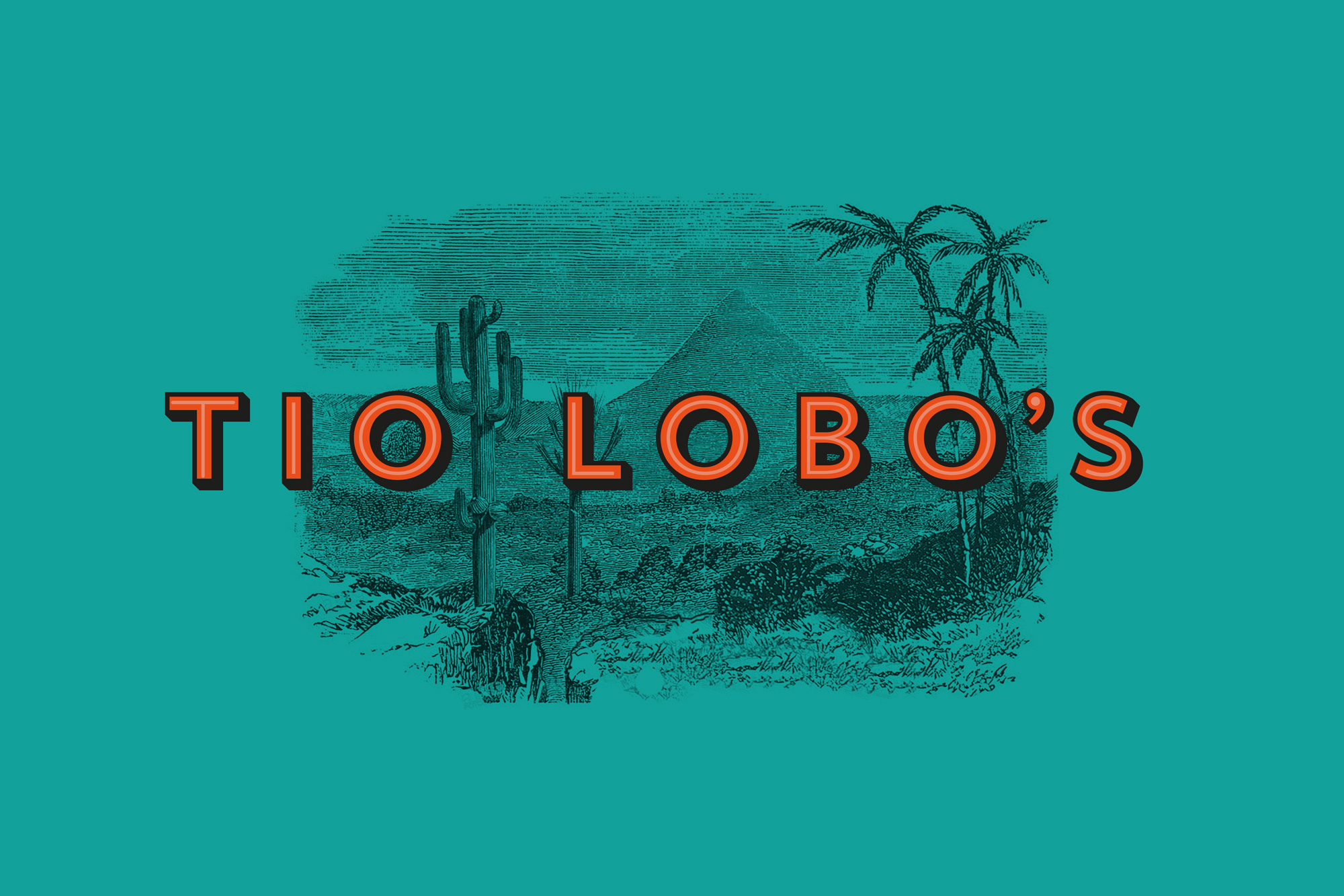
TIO LOBO’S © is a brand from Curaçao (Southern Caribbean). Chef Lobo is the creator of the best locally prepared snacks. We wanted to include the colourful and sunny vibe of the Caribbean island and the authenticity of the product itself into the brand. Although the origin of the ”bitterball” snack itself is Dutch, Lobo’s famous filling is a traditional recipe from Curaçao and produced with local Caribbean ingredients. We wanted to reflect that in a colourful and traditional way. We designed and created this authentic identity with great joy and pleasure. Visually and conceptual.
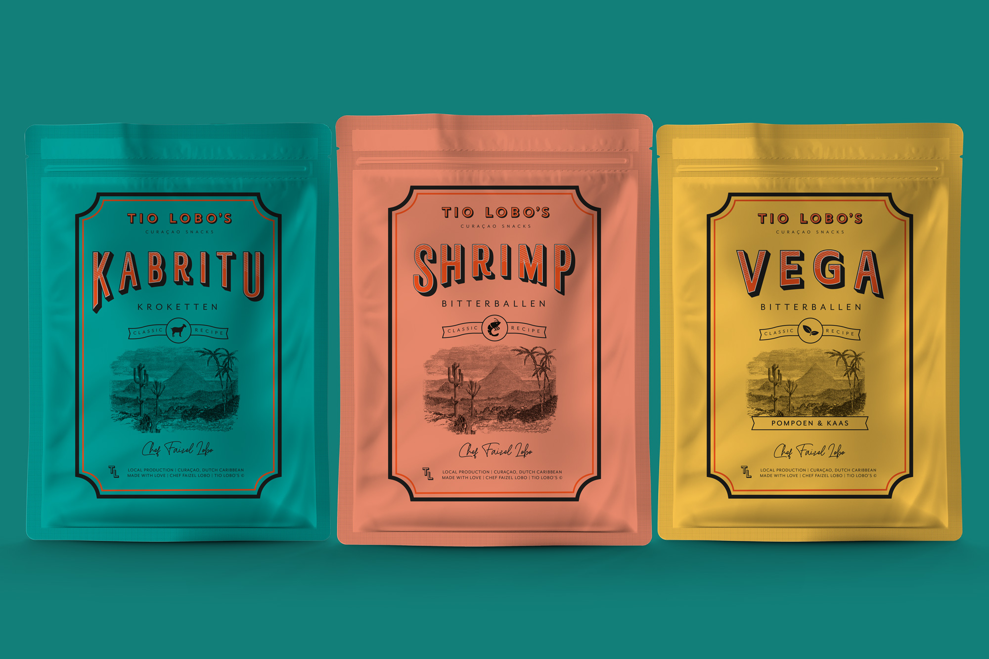
These are some of the (packaging) designs that we did for TIO LOBO’S.
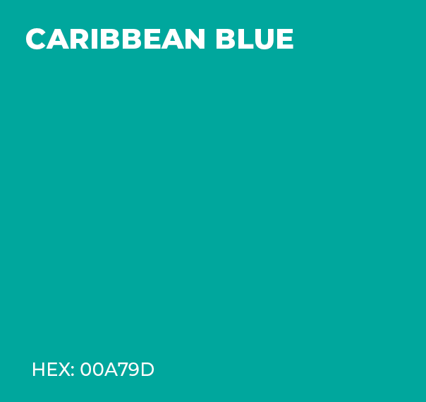
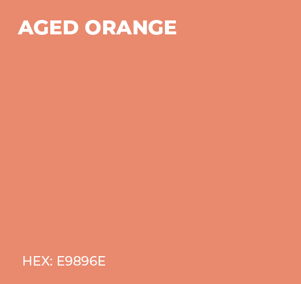
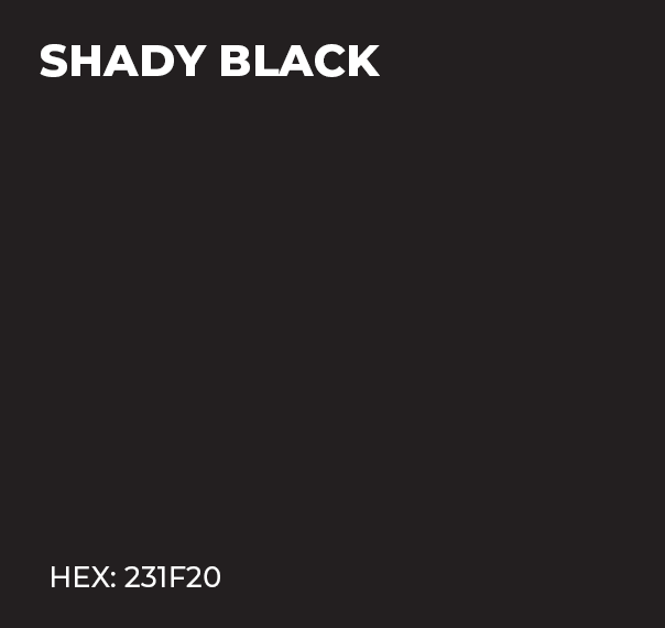
We’ve provided TIO LOBOS with a Caribbean colour scheme. The Caribbean blue colour has been chosen to reflect the beautiful oceans and clear blue sky. The orange colour is a nod to the Netherlands and also to the beautiful sunsets on the island. These main colours are accompanied by an ”aged” orange. Most houses on Curaçao are painted in bright colours, which discolour over time and fade due to the daily exposure to the coastal climate and the bright sunlight. For the same reason, the choice was made to give each product packaging a different colour, in order to recreate the colourful feeling of the island of Curaçao.

The Montserrat Family and Trend Sans have been selected as fonts for TIO LOBO’S.


There is a taste for everyone. Chef Faizel continues to expand his flavours for TIO LOBO’S, making it increasingly colourful.


