The Story
LionsDive Beach Resort is one of the leading Resorts on the
Caribbean island of Curacao. The resort evolved over the
past decade and earned its 4 stars. It was time to embed
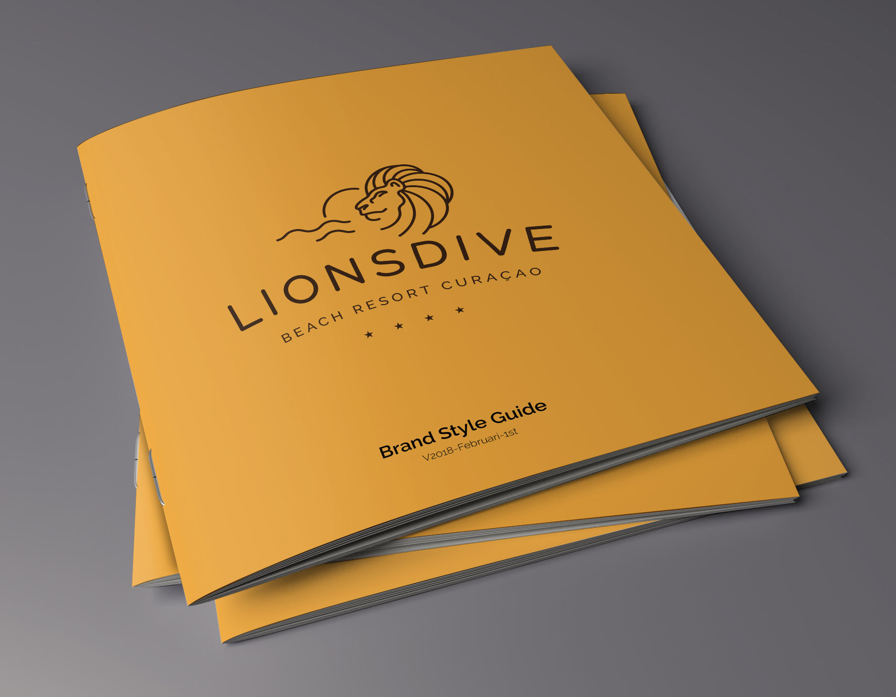
this into an evolved brand identity. Therefore, LionsDive
asked me to design a logo. The logo was well received and
welcomed by the resort’s management. Based on this logo
the LionsDive management, Melrose and The Dutchman worked closely together to redesign a brand new identity. An identity based on three keywords: Relaxing, Beach and Quality.
These keywords became the common theme in this visual
identity. Apart from these keywords, there were a few other
things to consider in the creative process. The name
LionsDive wasn’t always written like this. What was
previously called Lions Dive & Beach Resort, is now
changed to LionsDive. One word, fast and easy to
remember. And almost impossible to misspell.
Of course, we want to make sure that people understand
what LionsDive is. This is why we came up with the subtitle
‘Beach Resort’ and ‘Beach Resort Curaçao’ used for
international matters. Also, we discussed the lion as the
main character of the Resort. Besides that, a lion has a
symbolic meaning of strength, wisdom, and generosity it
can also be a very powerful, recognizable, and
characteristic trademark. This is why we decided to use the
Lion as a symbol (emblem) for LionsDive’s renewed visual
identity.
We want to make sure that LionsDive visually stands out in
the wide range of resorts, hotels, and accommodations in
Curacao. We choose a modern but also timeless
minimalistic design that gives LionsDive the fresh beachy
and classy look it should have.
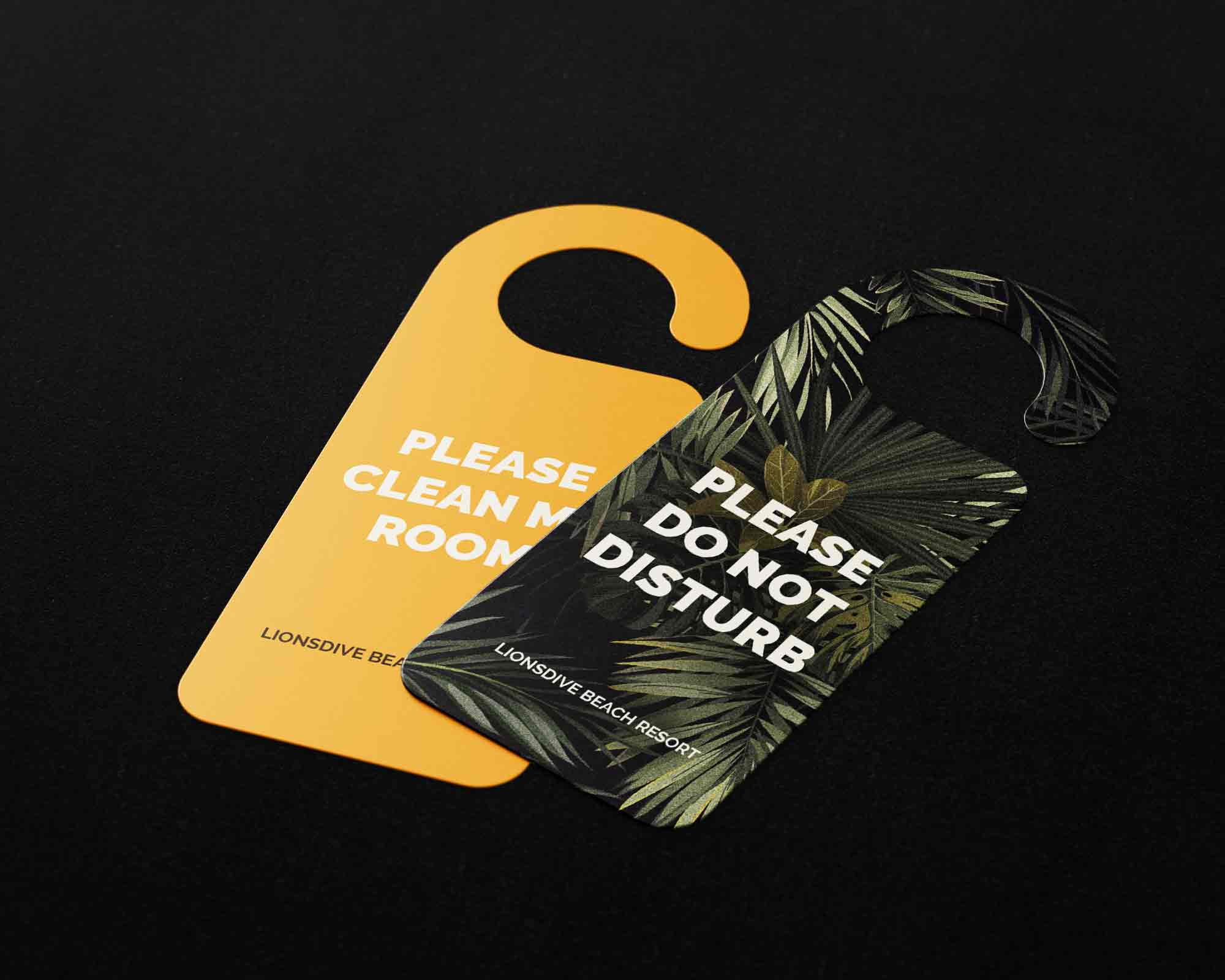
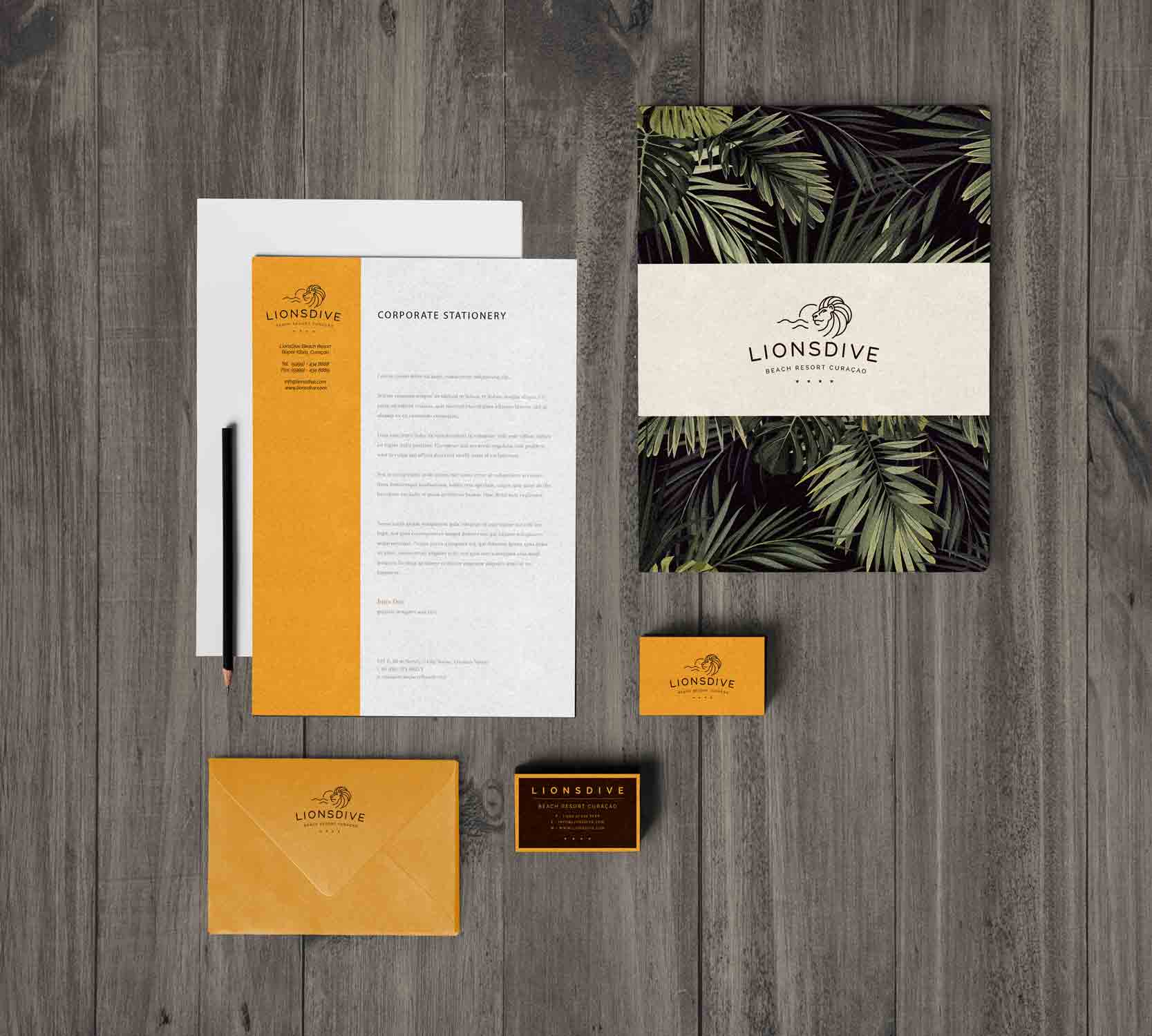
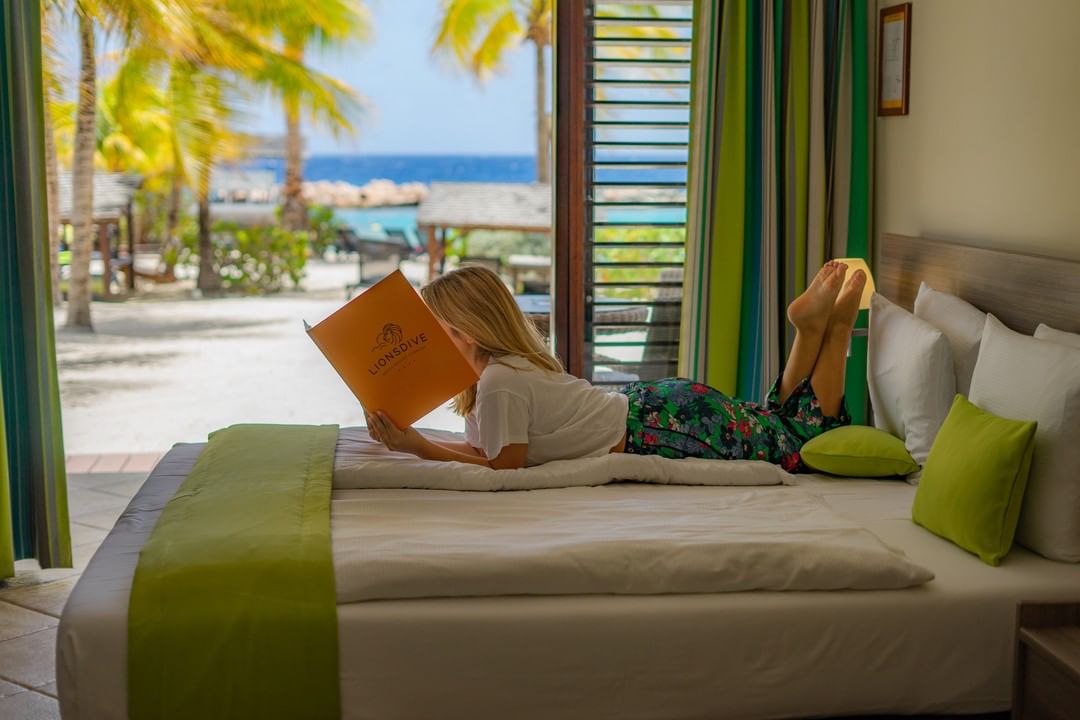
These are some of the hundreds of designs that we did for LionsDive Beach Resort Curaçao.
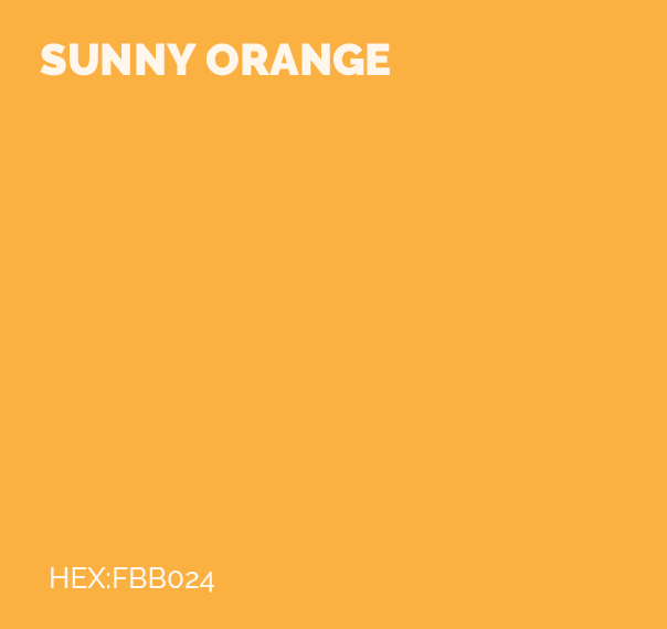
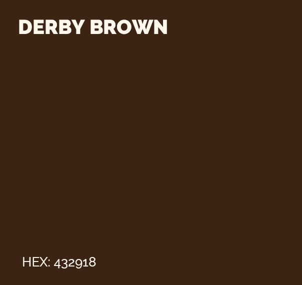
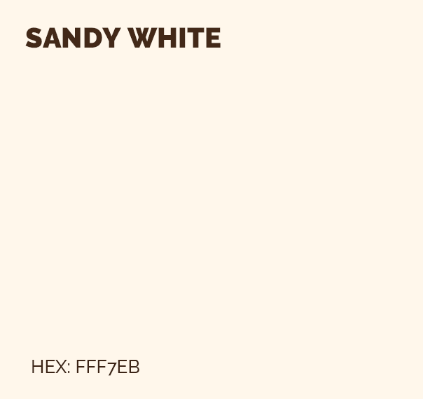
We provided LionsDive with a fresh new color scheme. Sunny Orange stands for: happiness, warmth, fun, energy, and playfulness. These words represent the way a family or guest should feel on their sunny holiday at the LionsDive resort. To complement the key color, we chose brown and beige for a classy, sandy, and yet tropical look.
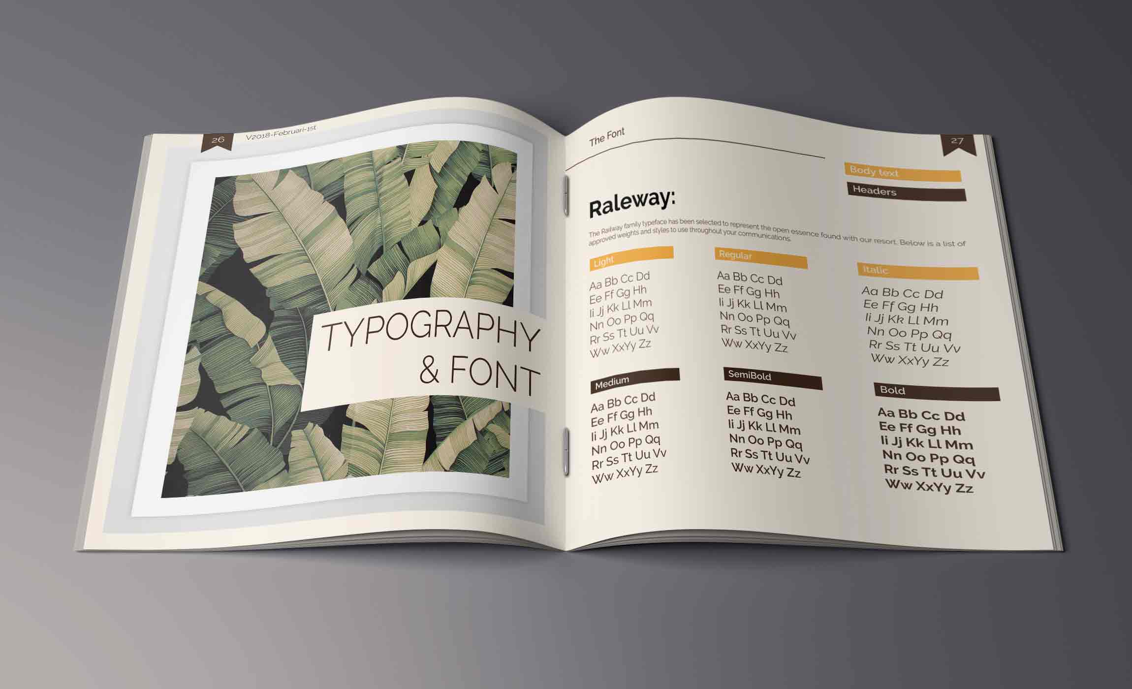
The Raleway Family typeface has been selected to convey the relaxed essence of our resort.


Animation for LionsDive. Purpose: a highway commercial in The Netherlands set to trigger holiday and sunny desires in the cold wintertime.
A key role
”They played a key role in defining the renewed brand identity and in developing the guidelines. They assisted with developing all the tools necessary for the implementation of the renewed identity within the organization. It is very easy for me to recommend them!”
